


Why airline CX analytics is different
In most industries, CX analytics means tracking digital behaviour and survey scores. Retail looks at cart abandonment. SaaS looks at feature adoption. Banking looks at call centre resolution. The data model is relatively contained.
Airlines are different. A single passenger journey touches booking systems, airport infrastructure, ground handling, cabin crew, catering, baggage systems, and often partner airlines through codeshares. The data that explains why a passenger had a bad experience might live in five separate systems owned by three different organisations.
That is why airline CX analytics cannot work as a standalone survey reporting tool. It has to sit on top of a journey-aware data model that brings together customer signals and operational context.
A meaningful CX view for airlines must answer questions like:
• How do delays on specific routes impact NPS by cabin?
• Which airports generate the most baggage-related complaints?
• Which disruption scenarios create the highest churn risk among frequent flyers?
• What is the revenue at risk when a hub consistently underperforms on disruption recovery?
If your analytics cannot answer those questions within a few clicks, it is not airline CX analytics. It is a survey dashboard with an airline logo on it.
McKinsey has described this as the “clairvoyant airline” concept: an operation where every decision is informed by real-time data drawn from across the organisation. They estimate that this kind of data-driven approach could be worth 5 to 10 percentage points of margin improvement. That is not a CX initiative. That is a business transformation.
Most airlines are nowhere near that vision yet. They have data in abundance but insight in short supply. The gap between where they are and where they could be is exactly where airline CX analytics fits.
Table of Contents
The core metrics for airline CX analytics
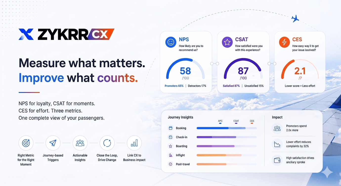
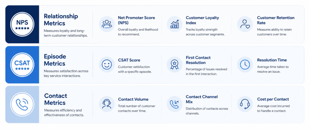
Airline CX analytics organises around three layers of metrics. Each layer answers a different question, and you need all three working together.
1. Relationship metrics
These tell you how passengers feel about your airline overall.
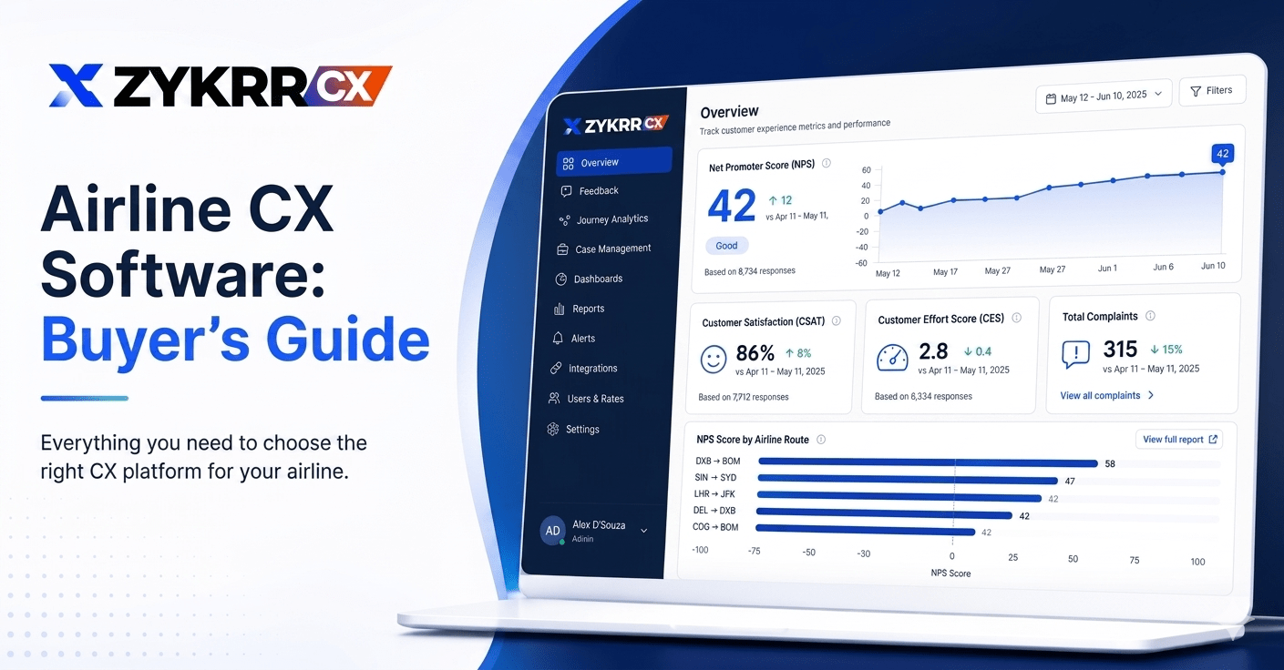
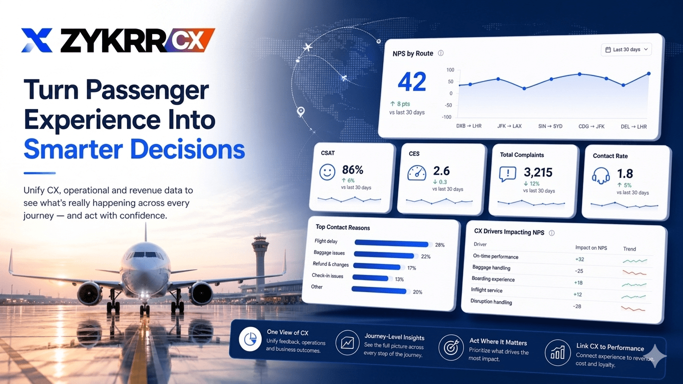
• NPS by route, cabin class, geography, and loyalty tier. This is the metric your leadership team watches most closely, and it gives a directional signal on long-term loyalty. But NPS alone does not tell you why scores are moving. You need to slice it thin enough that patterns emerge.
• Net sentiment from open-text comments and social media. This is where LLMs add real value. Instead of reading thousands of comments manually, text analytics can surface the themes driving promoter and detractor scores across routes and time periods.
2. Episode metrics
These tell you how passengers felt about a specific interaction.
• CSAT and CES for booking, check-in, airport, inflight, disruption, and baggage. Episode metrics pinpoint which part of the journey is pulling down your overall relationship scores. If NPS is dropping on a route but you do not know why, journey-specific CSAT will usually point you to the right section.
• Resolution time and first-contact resolution for complaints and support tickets. These are operational CX metrics that contact centre leaders care about. A complaint resolved in one call has a fundamentally different CX impact than one that takes four calls and two weeks. For a full breakdown of when to use NPS vs CSAT vs CES, see our guide to airline passenger experience
3. Contact metrics
These tell you where the system is failing passengers.
• Contact rate per booking or per passenger. If your contact rate is rising, passengers are hitting friction that your digital channels are not solving.
• Repeat contact rate within a defined window. High repeat contact means passengers are calling back because their problem was not fixed the first time.
• Top contact reasons, broken down by digital vs offline channel. This shows you where self-service is working and where it is pushing people to the phone.
Operational data that must feed airline CX analytics
Airline CX analytics becomes powerful when you layer experience signals on top of operational reality. Without that connection, you are guessing.
• On-time performance by route, airport, and time of day. This is the single most common driver of NPS variation across routes. A route that is consistently 20 minutes late will show lower NPS regardless of how good the cabin product is. Morning flights tend to perform differently from evening connections. Your analytics needs to let you filter at this level of detail.
• Delay codes and cancellation reasons. Not all delays are equal in the passenger’s mind. A weather delay feels different from a mechanical delay, which feels different from a crew scheduling issue. Your CX analytics should be able to filter feedback by delay type so you can see which causes create the most damage.
• Misconnect rates. When a passenger misses a connecting flight, the experience impact cascades across the rest of their trip. Misconnect data tied to CX feedback tells you which hub operations need attention.
• Baggage mishandling rates and recovery time. Baggage is one of the highest-emotion touchpoints in aviation. SITA’s 2025 Baggage IT Insights report found that the mishandled baggage rate dropped to 6.3 bags per thousand passengers in 2024, down from 6.9 in 2023 and 67% lower than 2007. But because passenger volumes hit a record 5.3 billion, the total number of mishandled bags was still 33.4 million. Baggage mishandling cost the industry an estimated $5 billion in 2024. Each of those 33.4 million bags is a passenger whose trip was damaged, and most of them will remember it when they book their next flight.
• Queue time estimates where available. Long check-in or boarding queues create stress that colours the rest of the journey, even if everything after that goes well.
This operational context helps you distinguish between problems you can fix (process, communication, staffing) and conditions you can only manage around (weather, ATC, airport infrastructure).
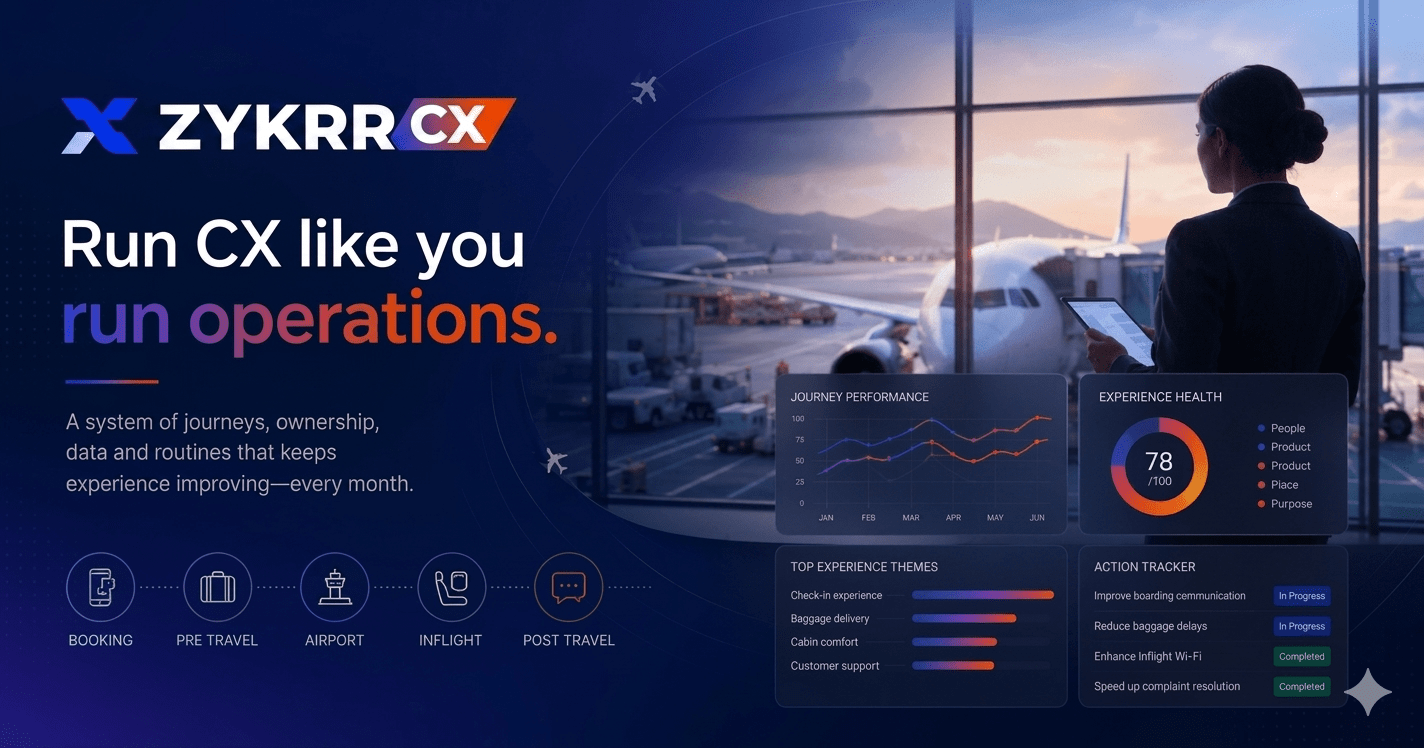
Dashboards that work for real airline teams
Dashboards are only useful if the person looking at them can act on what they see. Most airline CX dashboards fail because they try to show everything to everyone. The fix is role-based views that share the same underlying data but present it differently.
1. Executive view
Executives need a monthly or quarterly picture that answers three questions: are we getting better or worse? Where are the biggest risks? What should we fund?
Overall NPS trend and key journey CSAT scores. The top five routes or airports by risk, combining low scores, high complaint volume, and revenue exposure. Trends in complaints and contact volume. A high-level view of how CX metrics connect to revenue indicators like churn, repeat booking rate, and ancillary uptake.
Keep it to one screen. If an executive has to click through four tabs to understand the state of CX, they will stop looking.
2. Station and hub view
Station managers need a daily or weekly view that answers: what happened here? What needs attention today?
NPS and CSAT broken down by journeys that start or end at their station. Baggage, boarding, and disruption performance specific to their airport. Open and overdue cases assigned to the station, with days-since-creation visible. Comparison to other stations in the network so they know where they stand.
The station view should work on a tablet. If the station manager cannot check it at 6 AM between flights, it will not get used.
3. Contact centre and digital view
Contact centre leads and digital product managers need a view focused on effort and failure demand.
CSAT and CES for calls, chats, and email interactions. Top reasons for contact, tracked over time so you can see whether a new app release reduced calls or made them worse. Drop-offs in digital self-service that push passengers to the phone. If your app has a rebooking flow that 40% of users abandon, that is not a survey insight. That is a product bug showing up in your contact volume.
Using airline CX analytics for prioritisation
Analytics is useful only when it changes decisions. The most common failure mode in airline CX is producing beautiful dashboards that nobody acts on. Here is how to make analytics drive actual change.
• Use CX data to prioritise process changes in disruption handling. If your analytics shows that passengers rebooking after a weather delay at Chicago O’Hare have the lowest CES scores in your network, that is where you invest in better communication and faster rebooking flows. Not a cosmetic app update. A process fix.
• Identify routes where small improvements prevent high churn among valuable segments. McKinsey found that one full-service carrier achieved a 50 percentage point increase in digital experience NPS while increasing ancillary revenue per passenger by more than 50% and reducing airport costs per passenger by nearly 20%, all through a targeted tech and CX transformation. The returns are there when you focus analytics on the right problems.
• Show how better baggage recovery reduces compensation and complaint handling cost. If your analytics can connect baggage recovery time to complaint volume and resolution cost, you can build a financial case for investing in better tracking technology or faster courier services.
With baggage mishandling costing the industry $5 billion a year, even a small percentage improvement in recovery speed pays for itself. Connect CX scores to ancillary revenue. If passengers who rate their booking experience above 8 out of 10 buy 30% more seat upgrades and extra bags, that is a revenue insight, not just a satisfaction insight. Most airlines do not make this connection because their CX data and their commercial data live in different systems.
Connecting CX analytics to revenue
This is where most airline CX programmes stall. They can show that scores went up, but they cannot prove it affected revenue. Without that link, CX stays a nice-to-have rather than a funded priority.
ZYKRR’s monetization layer addresses this by letting you model “what if” scenarios. For example: if you lift NPS for delayed flights out of a specific hub by five points, how does that change rebooking rates and churn among business travellers on that route? If you reduce baggage mishandling recovery time from 72 hours to 24 hours, how does that affect complaint volume and compensation cost?
Harvard Business Review research, originally based on work by Bain and Company, shows that boosting customer retention by just 5% can increase profits by 25% to 95%. In an industry where frequent flyers generate a disproportionate share of revenue, the connection between experience analytics and financial outcomes is not theoretical. It is measurable. If your top 10% of customers by revenue are also the ones most exposed to disruption on your busiest routes, that is where your analytics should point first.
ZYKRR connects journey-level CX data to churn, repeat purchase, upgrade behaviour, and share of wallet, turning analytics from a reporting function into a financial planning tool. Learn more about how our airline CX platform works.
LLM helper prompts for airline CX analysts
Your analytics team can use these prompts with ZYVA or any LLM to get deeper insights from your data faster.
Route prioritisation
“You are a CX analyst at an airline. Combine these NPS scores and delay data tables and highlight which routes should be prioritised for disruption communication improvements. Rank by revenue risk.”
Revenue impact analysis
“You are a revenue manager. Use this CX dataset to identify where poor experience is most likely to impact premium cabin repurchase. Quantify the estimated revenue at risk for each route.”
Comment theme analysis
“You are a text analytics specialist. Read these 1,000 verbatim comments from passengers on disrupted flights. Group them by theme, rank themes by frequency, and flag any emerging issues that were not present last month.”
Dashboard improvement
“You are a CX reporting lead. Review these three dashboard screenshots used by station managers. Identify which metrics nobody is acting on and suggest replacements that would drive daily decision-making.”
Churn prediction input
“You are a data scientist building a churn model for an airline. List the top ten CX-related features that should be included as inputs, and explain why each one is predictive of passenger churn.”
Frequently
Asked Questions
-


What is the biggest mistake airlines make with CX analytics?
Building dashboards that nobody acts on. Analytics is only valuable when it drives decisions. The fix is connecting analytics to workflows: when a score drops below a threshold, a case gets created, an owner gets assigned, and the outcome gets tracked. Without that closed loop, analytics becomes a reporting exercise.
-
How does ZYKRR handle airline CX analytics?
ZYKRR connects survey feedback, operational data, and case management into a single analytics layer built for airline operations. It includes role-based dashboards for executives, station managers, and contact centre leads, plus a monetization layer that links CX improvements to revenue outcomes like churn reduction and ancillary uptake.
-
Can LLMs help with airline CX analytics?
Yes. LLMs can process thousands of verbatim passenger comments per week, surface themes that manual review would miss, and generate summaries for leadership. They can also help analysts write queries, draft reports, and identify emerging issues in comment data before they show up in structured metrics.
-
How does airline CX analytics connect to revenue?
By linking journey-level CX scores to churn rates, repeat booking behaviour, ancillary uptake, and complaint handling costs. If you can show that a five-point NPS improvement on a route correlates with measurable churn reduction among high-value passengers, you have a revenue case, not just a satisfaction report.
-
What operational data should feed into airline CX analytics?
At minimum: on-time performance by route, delay codes and cancellation reasons, misconnect rates, baggage mishandling rates and recovery times, and contact centre metrics like contact rate per booking and repeat contact rate. Queue time data is valuable where available.